Mobile Checkout Overview
PayPro Global checkout pages are fully responsive and optimized for mobile devices, tablets, and desktop environments, providing a seamless purchasing experience regardless of screen size or operating system.
The mobile checkout interface automatically adapts to the customer’s mobile device, using a clean single-column layout designed for easy navigation and fast completion. This approach minimizes distractions, improves readability, and makes the payment process intuitive on smaller screens, helping reduce checkout friction and cart abandonment.
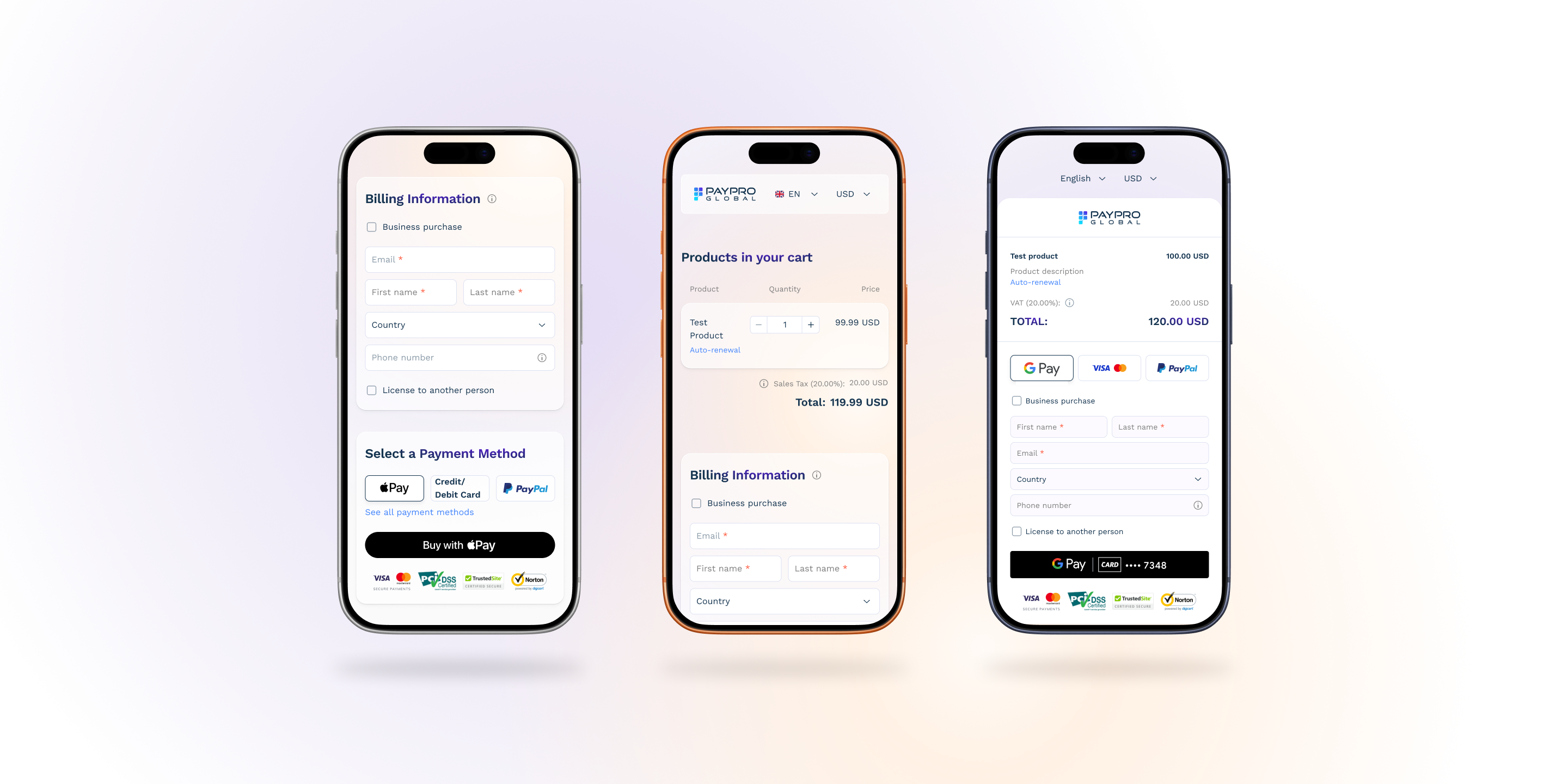
The mobile checkout is intentionally designed to be simple and easy to use:
- Single-column responsive layout for improved usability on mobile and tablet devices
- Touch-friendly interface optimized for smaller screens
- Minimal friction checkout flow to reduce abandonment
- Support for one-time purchases, subscriptions, renewals, and upgrades
- Secure payment processing across supported payment methods
-
The mobile checkout dynamically localizes the purchasing experience by automatically detecting the customer's language, country, currency, device, and browser. Available payment methods and digital wallets are then displayed based on compatibility and regional availability.
-
To enable Apple Pay and Google Pay, additional setup is required. Please contact our team at accounts@payproglobal.com for assistance.
To ensure the best mobile conversion rates, we recommend:
- Embedding checkout links in mobile-friendly landing pages
- Avoiding excessive redirects before checkout
- Testing checkout behavior across different devices and browsers
- Allowing the system to display payment methods dynamically instead of hardcoding customer expectations around specific methods (e.g., Apple Pay, Google Pay, or regional payment options)